Craftic Identity
I firmly believe that a commitment to a strong graphic identity can greatly impact a crafter’s success. From business card to website to packaging, if everything you do is branded in a professional manner, then the public perception of your product will be positively impacted. I saw some really great crafter's with excellent attention to graphic identity at Renegade and I’d like to share my favorites.
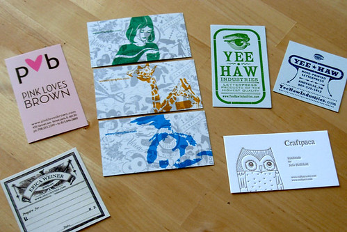
{Please click the photo above to link to flickr for notes on how to access the websites for these wonderful design-oriented people.}
My two absolute favorites were from Craftpaca and Erica Weiner.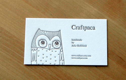 I first saw this card in the hand of a passerby while I was manning my own booth. It was so beautiful that I stopped the browser and asked to see it. I managed to make my way over to Julie's booth later in the fair and I was not dissappointed, but I probably would never have gone in if I hadn't see that card. The letterpress is just devine on it. I love the deep impression. I love it so much that I sent her an email after the fair to inquire where she had them printed. Turns out that it's all in the family and her brother prints them on a letterpress in his garage. He doesn't have a website yet, but when he does, it will be Letter Press Delicacies.
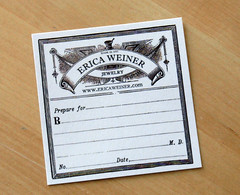 Erica's card is another that drew me to her station at the fair even though I hadn't seen any of her work. Anyone who has a card that cool must have cool things, I figure. Although I could barely squeeze into her booth because of all the people, I managed to snag one of these oh-so-clever cards. I'm already a sucker for the vintage pharmacy look and this is a very innovative way to have both a business card and a custom order slip. Kudoz to both Erin and Julie for excellent sense in design and advertising. They understand that a business card is a mini-billboard and they've put that concept to good use. Now if I can just manage to do the same...

{Please click the photo above to link to flickr for notes on how to access the websites for these wonderful design-oriented people.}
My two absolute favorites were from Craftpaca and Erica Weiner.
 I first saw this card in the hand of a passerby while I was manning my own booth. It was so beautiful that I stopped the browser and asked to see it. I managed to make my way over to Julie's booth later in the fair and I was not dissappointed, but I probably would never have gone in if I hadn't see that card. The letterpress is just devine on it. I love the deep impression. I love it so much that I sent her an email after the fair to inquire where she had them printed. Turns out that it's all in the family and her brother prints them on a letterpress in his garage. He doesn't have a website yet, but when he does, it will be Letter Press Delicacies.
 Erica's card is another that drew me to her station at the fair even though I hadn't seen any of her work. Anyone who has a card that cool must have cool things, I figure. Although I could barely squeeze into her booth because of all the people, I managed to snag one of these oh-so-clever cards. I'm already a sucker for the vintage pharmacy look and this is a very innovative way to have both a business card and a custom order slip. Kudoz to both Erin and Julie for excellent sense in design and advertising. They understand that a business card is a mini-billboard and they've put that concept to good use. Now if I can just manage to do the same...


0 Comments:
Post a Comment
<< Home